Tuesday, June 17, 2014

Villa Koi - COMPLETE


This is the completed painting, Villa Koi.  I hope you enjoyed seeing all the stages that led to the finished piece. 

Monday, June 16, 2014

Villa Koi - the Koi stages


Here come the Koi!


Working on the white Koi.


And then the orange and white Koi.


Extreme Koi close up.


Sunday, June 15, 2014

Villa Koi - the pond stages


This is the beginning of a painting of the Koi fish at the Getty Villa. 


Putting in the first layer of the pond - a pea green wash.


Laying in the second layer of color in the pond. From this point on, all the paint is applied with a palette knife.


Adding some green to the pond floor.


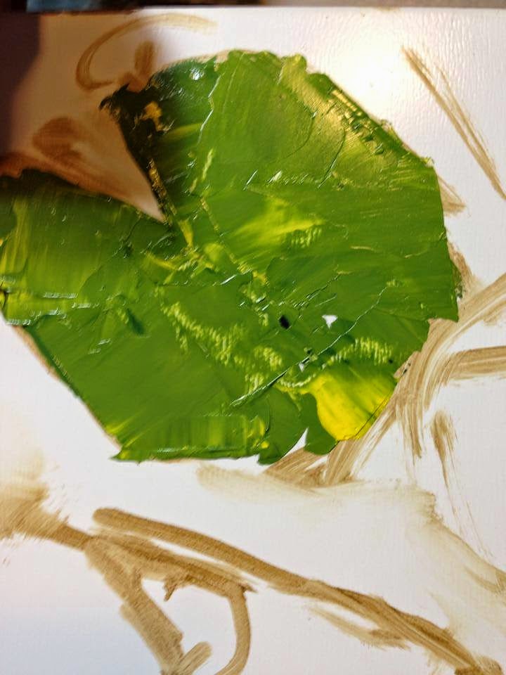
Laying in the first lily pad.


The next lily pad is a deep, dark red and green.


And another lily pad in another beautiful variation of green.


Added another layer of a much lighter green, letting the dark green show through.


Now for some tiny lily pads.


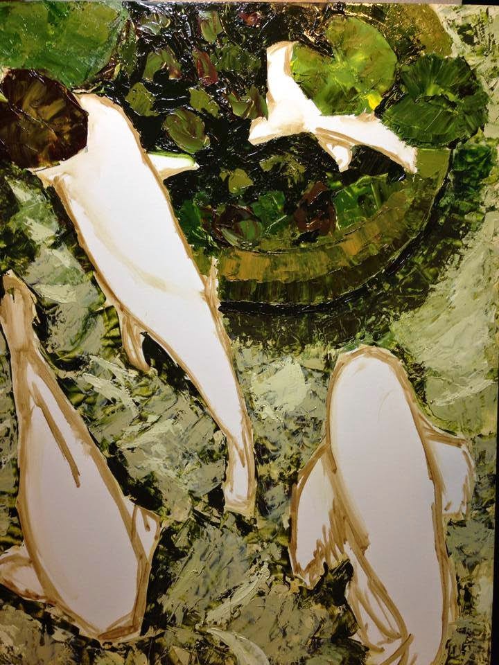
Spent some more time on the light layers in the pond and then started on the submerged lily bowl.


Added some more color to the bowl but not too sure about the green.


Darkened up the greens on the pond floor.


Added the rest of the paint to the submerged bowl.


Summer Dreams


Lucky to be juried into this show with the California Art Club this summer with Balboa at Topaz!


Thursday, March 27, 2014

Stained Glass But Not


Colleen Schaan is a regional instructor for Copic. I saw her video about making stained glass bottles with Copic ink. I did not have a glass bottle so I decided to use the mixed-media film that we used in a Copic workshop I attended this past January. My local Michael's and Joann's craft stores did not have a gold leaf pen but they did have silver leaf pen so what I ended up with looks like a stained glass window. 


Saturday, February 1, 2014

30 Paintings in 30 Days - Day 27-30 - Buildings, Sky, Clouds, Water, Reflections - COMPLETED


Buildings, Sky, Clouds, Water, Reflections - COMPLETED

For the last 4 days of the challenge I worked on completing this piece.  I changed the sky and the water color from what I did initially, going a little grayer.  The dark blue band at the top became too dark and I had to wash out a lot of the color with the Copic blender.  The tones in the clouds are very subtle and I think might benefit from a little more contrast in the future.  


Sunday, January 26, 2014

30 Paintings in 30 Days - Day 25 & 26 - 2 Buildings


2 Buildings

For the last 2 days I have been working on these 2 structures that appear with the clouds and water. Like the clouds and the water, these two buildings are also about reflection - what is about the water is also reflected in the water.  Watch for some changes in the red building, especially, as I develop the reflection.

Saturday, January 25, 2014

30 Paintings in 30 Days - Day 23 & 24 - Clouds and Water


Clouds and Water

This is a work in progress with copic alcohol inks. I spent a couple of days working on the clouds and then the water. There are a number of colors of ink at work here - blues, blue-greens and grays.  The water reflects the sky so you see the darker blues at the top and the bottom.  This is image is not an original image - it was given to me in my workshop as part of the study of the clouds and the water.

Wednesday, January 22, 2014

30 Paintings in 30 Days - Day 21 & 22 - That's Crazy!


"That's Crazy!"

On the first day, I applied a variety of fluorescent ink colors to the surface of a piece of drafting film. I let it dry a full 24 hours before I applied the layer of black ink. Their is little to no absorbing of the ink into the film, allowing the ink to spread out, but when it dries, holding the ink in place on the surface. Letting the ink set for 24 hours insures that. Consequently, when you apply a layer of ink on top of that, it spreads out over the ink rather than pushing the colors out of the way.  Now, put that all on top of a light box and this is what you get!  How do you like this compared to the ink paintings done on the other paper?

Monday, January 20, 2014

30 Paintings in 30 Days - Day 19 & 20 - Laguna Beach Bungalow


"Laguna Beach Bungalow"

Some time ago, friends sent me photos of their bungalow and I had every intention of painting it but never did. Now I know that it was waiting for the right medium - alcohol inks! I used a special paper designed for use with these inks and it makes all the difference. I can blend colors and not worry about over-saturating the paper or the ink bleeding into places I don't want it to go. The bright and rich colors look cheerful and invite you to the bungalow!

Saturday, January 18, 2014

30 Paintings in 30 Days - Day 18 - Translucent Experiment 2 with Layers


"Translucent Experiment 2 with Layers"

I took yesterday's piece and placed the blue, orange and green piece underneath.  When you put it on the light you can see how this really additonal layer brings depth and brightness, especially to the green.

30 Paintings in 30 Days - Day 17 - Translucent Experiment 2


"Translucent Experiment 2"

This is another go at the translucent paper applied with various techniques. I first painted on green, yellow and peacock blue inks and let them dry.  Next I dropped in some orange and yellow and moved some to the ink around with sticks and cotton. Finally, I applied light underneath. As you can see, some things worked and some things didn't and that is the joy of experimentation!

Thursday, January 16, 2014

30 Paintings in 30 Days - Translucent with Light and Layers


"Translucent with Light and Layers"

Something really cool you can do with this translucent paper is layer it.  On top you see the piece I posted yesterday. Underneath is another piece of translucent paper that is covered in ink washes of blue, orange and green and they are placed together on the light box. I really like the sense of depth that happens naturally with the layers. What do you think of the layers?

Wednesday, January 15, 2014

30 Paintings in 30 Days - Day 15 - Translucent with Light


Translucent with Light

This is my ink on translucent paper. I wanted to show you what it looks like when it is placed on a light box. The light coming through the paper and through the ink gives this image a whole other dimension that you don't get with the white paper.   

Tuesday, January 14, 2014

30 Paintings in 30 Days - Day 14 - Rupert


"Rupert"
Ink on paper

I completed this today. Here is another technique that I learned at my Copic ink workshop over the weekend.  You take your original photograph, scan it into line art, and then add all the color with the brush tipped markers.  Being a painter definitely gives me advantages with this method since I am trained to pick out colors and details.  And, it doesn't hurt that there are over 300 marker colors to choose from.  This is not my photograph, rather it was a photograph that we all were given as part of the workshop. I can't wait to try this with some of my photo references from painting.  I love painting with these brush tipped markers! There are clubs that meet weekly in Japan, we learned,  that are dedicated to producing this kind of art. I wonder if people here would enjoy making this kind of art?

Monday, January 13, 2014

30 Paintings in 30 Days - Day 13 - Stained Glass


"Stained Glass"
Ink on Gesso board

The workshop I attended on Sunday inspired me to think about trying new surfaces with the ink.  Here I have taken some gesso board that I would usually use oil paint on and applied ink.  What do  you think?  I used all fluorescent inks for this piece.  I like the way the ink soaks into the gesso. The very bright fluorescents are peeking through the darker fluorescent purple and together they make me think of stained glass.

Sunday, January 12, 2014

30 Paintings in 30 Day - Day 12 - Painting with Ink Workshop


Today I attended workshops put on by the folks at Copic International, the makers of my favorite alcohol based ink that I have been using for my ink paintings. This group is super enthusiastic about their product and they all use the inks regularly so they are a joy to learn from.  I wasn't totally happy with this piece when I brought it home today, so I fixed it so that the tail feathers were an abstract idea behind the peacock.

Saturday, January 11, 2014

30 Paintings in 30 Days - Day 11 - Breakthrough


"Breakthrough"
Ink
Print Available
Click here for more information.

The coral sea green is such a great color so I had to use it again.  I also love shades of pink and violet so I had to put these two together.  The swirling effect of the green is mesmerizing.

Friday, January 10, 2014

30 Paintings in 30 Days - Day 10 - Cloud Study


"Cloud Study"
Oil, 6"x6"

I love painting clouds.  Nature always surprises me with the forms and shapes it creates.  I never get tired of looking at the clouds.  You also don't realize how many shades of blue there are until you are painting the sky!
If you are interested in purchasing "Cloud Study", email me at lisampaynestudio@gmail.com.

30 Paintings in 30 Days - Day 9 - Silver Layers


"Silver Layers"
Ink
Print Available
Click here for more information.

There is an aspect of this that is very peaceful.  Layer upon layer of silver ink reflects whatever is around it and we can reflect when we look into it.

Wednesday, January 8, 2014

30 Paintings in 30 Days - Day 8 - Splash


"Splash"
Ink
Print Available
Click here for more information.

There is something very therapeutic about working/painting with ink.  There is only so much you can control and that is good to know from the beginning. Leaving so much white in this piece allows the colors to cheerfully pop off the surface.

Tuesday, January 7, 2014

30 Paintings in 30 Days - Day 7 - Once More Into the Breach!


"Once More Into the Breach!"
Ink
Print Available
Click here for more information.

When I look at this piece I feel like I could jump in.  The lighter green does a nice job of  keeping a lot the red and blue visible underneath.  Will you jump in?

Monday, January 6, 2014

30 Paintings in 30 Days - Day 6 - Earth Tones are Easy


"Earth Tones are Easy"
Ink
Print Available
Click here for more information.

I have wanted to do a total earth tone ink painting for some time.  There are multiple layers that were allowed to dry before adding the next layer.  When the wet ink falls on to the dry ink, as it pushes out it makes these wonderful rings.  The earth tones were not so easy as the colors as it is all too easy to end up with just a sea of brown.

Sunday, January 5, 2014

30 Paintings in 30 Days - Big Bang


"Big Bang"
Ink
Print Available
Click here for more information.

For this ink painting, I was a bit messier than usual.  I like how there are layers of color that lie beneath with the gold and yellow bursts peeking out from underneath.

Saturday, January 4, 2014

30 Paintings in 30 Days - Day 4


"Copper, Pearl, Orange"
Ink
Print Available
Click here for more information.

I had some more metallic ink so I had to do another piece.  This time, after I applied the copper and the pearl, I added the orange on top of it.  I like how you can see the metallic ink underneath the color.

30 Paintings in 30 Days - Day 3


"Gold and Silver Royale"
Ink
Print Available
Click here for more information.

I wanted to experiment with metallic inks so I started off with with gold and silver.  The metallic inks were a bit thicker than my other inks so they held their shapes nicely while the beautiful blue swirled around them.

Thursday, January 2, 2014

30 Paintings in 30 Days - Day 2


Great Blue Heron
Oil,  20x35 on wood board
$1,200

Yes, this is not a new painting, but I was so excited to finish it and to post it for you to see that I am making it my Day 2 painting.  Today I added the legs, detail to the head and to some of the rocks.  I forgot to mention yesterday that this painting was done primarily with a palette knife and a small amount of brush work on the legs.   I am so lucky to live near where this guy and his friends like to hang out.

Wednesday, January 1, 2014

30 Paintings in 30 Days - Day 1


Great Blue Heron, Stage 2
Oil,  20x35 on wood board

What better way to start the new year than with a 30 Day Painting Challenge!  Artist Leslie Saeta is graciously hosting a 30 Paintings in 30 Days painting challenge to jump start all artists on the road to a prolific 2014.  Over 270 artists have decided this year to take up the challenge and post daily paintings to Leslie's blog for the next 30 days. I started Blue Heron in mid-November and decided that I would revisit him today.  I was not able to complete his portrait today; I need to add in the legs and the details on the beak, neck and the background.  

I hope you will enjoy following the the 30 Day Challenge this year!
Related Posts Plugin for WordPress, Blogger...